This is the second installment on my CalcTips series. Today, I am going to show you some tips on graphing.
Window and Format Settings
The Window and Format settings play an important on how the calculator graph a function. The window settings (accessible by the [window] key) dictate the portion of the view that requires drawing, and how to draw that portion of the view. The format setting (accessible by [2nd] [zoom]) dictates the format of the drawing, usually cosmetic. The exact functions of each of those settings are described below. Skip to the next section if you are not a nerd.
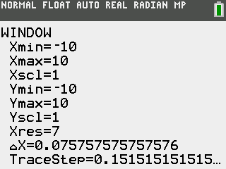
- Xmin & Xmax: The x-bounds of the graph.
- Xscl: The value per tick on the x-axis.
- Ymin & Ymax: The y-bounds of the graph.
- Yscl: The value per tick on the y axis.
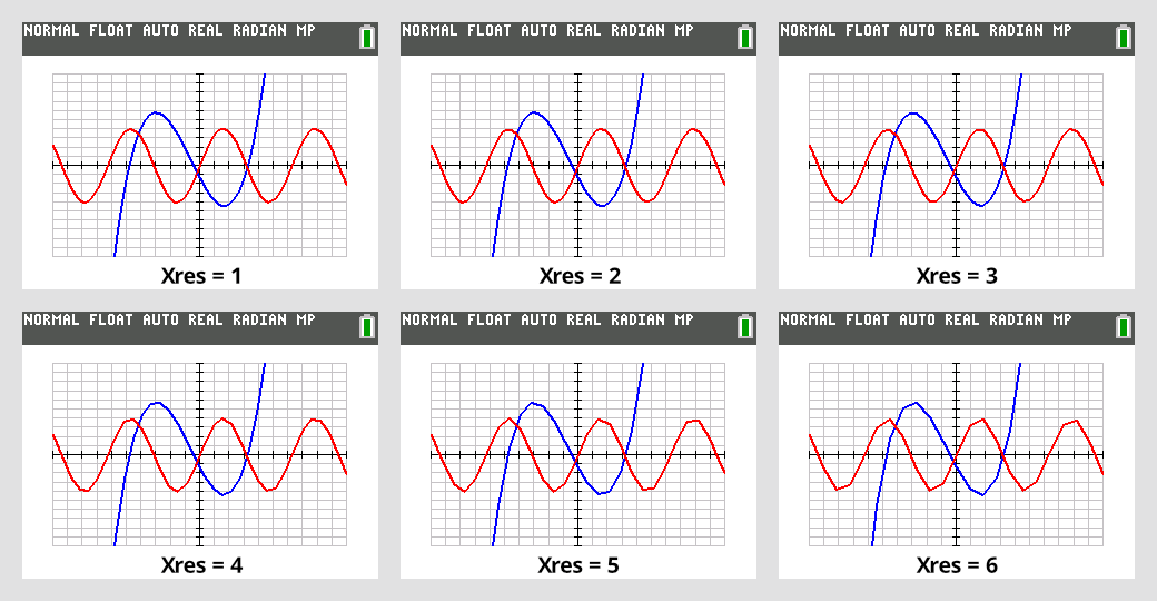
- Xres: The step size of each sample of the graph. (default is 1)(will be explained later)
- ΔX: The amount of each [←] or [→] arrow key steps in the graph window. This is also the number of x-value per pixel. Modifying this will change the Xmax setting.
- TraceStep: Similar to ΔX, this is the amount of each [←] or [→] arrow key steps in the trace mode. Modifying this will also change the Xmax setting.
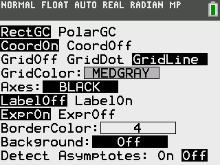
- [Rect CG | PolarCG]: Toggles between Cartesian and Polar coordinates systems.
- [CoordOn | CoordOff]: Toggles between whether to display coordinate while stepping using arrow keys.
- [GridOff | GridDot | GridLine]: Switch the grid mode.
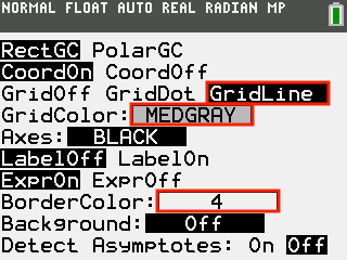
- [Grid Color]: Color of the grid.
- [Axis]: Color of the axis.
- [LabelOff | LabelOn]: Turn them off, we all know which one is x or y.
- [ExprOn | ExprOff]: Toggle whether to see the expression while using [calc] functions. Keep then on at all times.
- [BorderColor]: The color of the padding of the graph.
- [Background]: The background image of the graph. Leave them off.
- [DetectAsymptote]: Whether to sub-sample the graph to eliminate asymptote graphing artifact (this will be explained later).
Beautify your Graphs
You might ask. How do I use them properly so that I get the maximum usability? Well, let’s start with increasing readability.
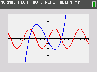
This is the default cosmetic setting, which looks very dull. The lack of gridline also makes it quite hard to eyeball where things are. But, in the format view, you can yank these settings in (outlined by the red rectangle), and you can get a graph that looks ten times more professional.
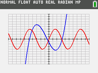
The other underappreciated features are using custom [window] settings. Let’s say you have an oscillating function, and it’s hard to determine its period in terms of π. Why not make every tick on the x-axis π by dialing in π as your x-scale. Now, it is much easier to eyeball.
Speed Up Graphing
If you are a calculus student, you must encounter a scenario: You’ve entered a complex function to graph. Then, as soon as the graph starts to appear, you know that it’s wrong. But you can’t figure out how to stop it from graphing the entire thing. Those old days are no more because pressing the [on] button (in the bottom left of your calculator) will stop the graph from graphing further, saving you valuable time on your next exam!

What if I tell you that your calculator can graph faster by using the [simultaneous] mode inside [mode]. This mode not only graphs faster, but also allows you to see all your function’s behavior at once. How useful is that!

You can speed up your graphing even more by disabling the [DetectAsymptote] from the [format] menu. The Detect Asymptote feature removes asymptotic artifacts by calculating more points between plotting one point and another. By disabling this feature, the calculator will calculate fewer points, which makes it faster. You can also further increase the graphing speed by using larger X-res like 3 instead of 1. This means that the calculator will plot a point every 3 pixels instead of 1, giving you a 3x speed!!
These modifications do come with penalties though. By disabling the Detect Asymptote feature, you may run into artifacts when graphing functions with vertical asymptotes. This happens when the calculator samples one point left of the asymptote and one point on the right. It still thinks that those two points should be connected, so it draws a line between the two. The Detect Asymptote feature elements this by subsampling between those two values, but with it disabled, it will never know there is an asymptote.
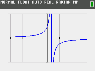
I still suggest leaving the Detect Asymptote feature off, because asymptotic functions are rare and you will already know what this artifact looks like if it appears by reading this post. Please also note that having an X-res larger than 1 automatically disables asymptote detection.
The other thing to note is that the larger the X-res is, the more jagged your graph is going to look. The image below shows this quality deterioration. I suggest an X-res of 3 or 2 as it balances the speed with accuracy. Please also note that an inaccurate graph is purely visual. It does not affect the accuracy of any calculation (like calculating value) made on the graph.
That is today's installment of CalcTips. Next time, I will show you some vector and matrix stuff. The next post requires significant research, so expect it to be after spring break.